Pages

Showing posts with label My World of Colours. Show all posts

Wednesday, 23 December 2020

Secret Garden #8 - A Christmas Doily

 Well, well, what do you know?  I've put down my colour pencils for more than 3 years now I just realised (looking at the date of my last piece)! >_<  That's quite like me, I go gung ho in the beginning with most of my projects but tend to not see them out (you can revisit my previous colouring works here).

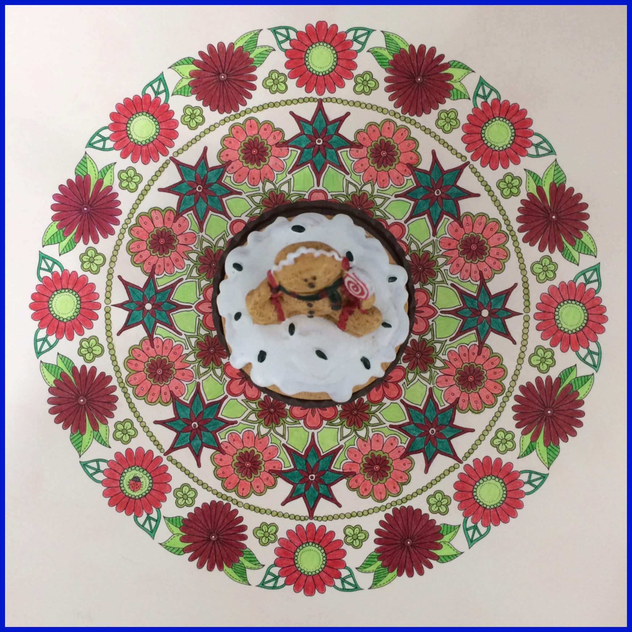
With Christmas just around the corner, the festivity was obviously the inspiration for this piece.  After all, tis' the season to be jolly.....and God knows we need a little bit of that after almost a year of upended lives (and livelihood) caused by the global pandemic.

So I decided to colour this piece like a Christmas doily!  What better then to go with the traditional Christmas colours of red and green (I only had 4 shades of red and 5 shades of green to work with).  And if you see some uncoloured parts, they were deliberately left that way to mimic the look of a crocheted Christmas doily. :P

Since this piece is still life, no shading is necessary to make the subject look real (or as real as possible).  So, it ended up to be the easiest piece I've coloured so far...but also the most boring....lol! :D

Only a little bit of creativity was needed to pair and match the different shades of red and green together.  There.....my pretend Christmas Doily is finished. ^_~

As we near the end of a roller-coaster year, I'm more than happy to see the back of a gloomy 2020 but also thankful to have come through it safely thus far.  So, here's wishing you some Christmas cheer & joy (even if it's just a little bit)!

And we welcome a hopeful new year, hopeful that the end of the pandemic is near as vaccines roll out.....and we can eventually return to some form of normalcy.

In the meantime, let's stay resilient and continue to mask up and adhere to social distancing if you have plans to celebrate the year end festivities with family & friends..... stay safe & take care.

Merry Christmas everyone! ^o^

Wednesday, 5 July 2017

Secret Garden #7 - Creepy Crawlies

After neglecting my colouring for far too long, losing a bit of inspiration along the way and a less than stellar performance in my last piece, Watering Can, I need to get my mojo back.  And what better to do that than with a wake-me-up jolt by colouring a piece that gives me the creeps!

And by that I mean colouring a piece that's filled with disgusting-looking insects.  You can call them whatever you want but they'll forever be Creepy Crawlies to me...they give me the goosebumps! >.<


Blank Canvas

Work in Progress #1

I detest anything with six legs that crawls, hops or flies...with the exception of probably ladybugs and butterflies coz the former is cute while the latter is colourful.  So, colouring this wasn't the easiest thing coz I hate insects so much...and cockroaches are my worst nightmare (and there were some in this piece).


Work in Progress #2

Initially, my colouring concept was to colour them as close as possible to real-life insects.  So, I had to google pics of real insects to get some inspiration on how they should be coloured.  Sometimes I could feel my hair stand on end when looking at these insects and their hairy legs...eww! >_<


Work in Progress #3

Work in Progress #4

After a while, I took a different stand and knew I had to make this piece as less creepy as I could.  And the best way to go about it was to make it as colourful as possible.


Work in Progress #5

Since this piece wasn't in any way symmetrical, I decided to abandon colouring them in similar colours even for the similarly drawn insects.  So, this piece was done totally "freestyle" without any rules of consistency.


And I couldn't be happier when my hair-raising piece on Creepy Crawlies was finally completed.  Did I get my mojo back? ^_~

Trying to colour a piece as colourful as possible isn't the easiest thing to do when you only have 36 colours to work with...this is the time you really wished you had more in your box of colour pencils. :'(

Onwards to my next colouring adventure! ^_*

Wednesday, 22 March 2017

Secret Garden #6 - Watering Can

Oh dear, looks like I've neglected my colouring for a while as it has been 3 months since my last piece, Wishing Well.  Since I enjoyed the free-hand aspect of that non-symmetrical piece, I chose another similar non-symmetrical artwork to colour next.

Blank Canvas

Work in Progress #1

Work in Progress #2

Work in Progress #3

Since it's about a Watering Can, I thought I'd keep it simple and go with two primary colours....shades of blue (to depict water) and shades of green (for the leaves).

Work in Progress #4

Since the whole piece uses predominantly just two colours, I made sure I coloured the some of the insects and flowers in brighter colours to add a splash of colour to the piece to make it pop....just a little! ^.^

And my second non-symmetrical piece called Watering Can is completed!

Hmmm....this isn't my finest hour, erm, I mean finest piece! :'(  I think I've put my pencils down for far too long...and lost a bit of inspiration, perhaps? >_<

 Well, I better scurry along to my next piece then! *_~

Wednesday, 14 December 2016

Secret Garden #5 - Wishing Well

After colouring my first three pieces from Johanna Basford's Secret Garden Colouring Book (Artist's Edition) in symmetrical form and colouring my last one (Rainbow Tree) non-symmetrically (even though the artwork was drawn symmetrical), finally here comes one piece that's not drawn symmetrically.

And that can only mean one thing....free-hand...no rules, no remembering what exact colours to use (for the corresponding similar parts), no need for balance and consistency.....:)

Blank Canvas

Work in Progress #1

But, before I go completely crazy with free-hand, I need to rein in some rules so that I don't go overboard! ;)

Work in Progress #2

Work in Progress #3

My approach to this piece, even though the artwork isn't symmetrical in nature, was to colour similar (or almost) parts (like leaves with the same design) with the same colours to achieve some form of consistency.


Work in Progress #4


Work in Progress #5

Without going overly colourful with the flowers (which you can if you don't control yourself), I restricted myself to shades of pink, red and purple for both the flowers on the ground and in the air...with the exception of a splash of blue.

Here's my completed Wishing Well....just for you!

Hey, Christmas is just round the corner...so, make a wish....at my Wishing Well ^_*....and I hope you get all that you wished for...and more!

I'm ready for my next colouring assignment! ^.^

Wednesday, 19 October 2016

Secret Garden #4 - Rainbow Tree

After colouring my first three pieces (Enter My Secret Garden, Tree House & Love Actually) all in symmetrical form, here comes a piece that's not (and by that I mean the colouring though the drawing by Johanna Basford is symmetrical).

Wanting to try some other form of colouring, besides colouring symmetrically in all my previous pieces, I got some inspiration from some of the completed pieces I saw online and went a different route with this one which I shall name Rainbow Tree :)

My approach with this piece was to colour them in a spectrum of colours like the rainbow (or Sir Isaac Newton's Colour Wheel)....."ROY G BIV" (red, orange, yellow, green, blue, indigo & violet).  I tried my best to choose colours closest to the spectrum but I was limited by my box of 36 colours! :'(

Blank Canvas

Work in Progress #1

I started with the tree trunk and worked from bottom to top starting with violet and ending with red.

Work in Progress #2

Then I began to work on Section I of the tree leaves starting with violet and colouring from left to right.  I only had 3 shades of purple  to work with...and two of them were more reddish-pink than purple (there were six violet colours listed in the colour chart that came with my box of colours but...argh....I didn't have a single violet in my box) T_T

Work in Progress #3

Then I moved on to Section II with indigo and, since there was only one shade of indigo, I had to combine it with four other shades of blue.

Work in Progress #4

Since I already combined indigo with blues, I had to go blue-green for Section III.  This was really tough as I only had two colours to play with (+ a little cheat help from one indigo shade).

Work in Progress #5

For Section IV, I got back on track and had five shades of green to work with (yay!) ^o^

Work in Progress #6

Following the spectrum, we come to yellow for Section V and, although I had three shades of yellow, one was too light to be visible, so I could only use two of them.  Even if you do shading with yellow, it's too light to be seen, so I had no choice but to add some browns to make it more visible.

Work in Progress #7

Section VI is orange and (again) I have only two shades of orange and so I added one dark yellow coz it was more orange than yellow.

Since the drawing is symmetrical, obviously the colouring should have been divided into six parts but in order to accommodate the colours of the rainbow (of which there are seven), I had to squeeze the yellow and orange into smaller sections.  

Work in Progress #8

Finally, I finished off with red for Section VII.  For shades of red, I had four choices! ;)

Tip #10 - If you're not sure what colours combine well together, using the rainbow spectrum as a guide is certainly helpful.  Otherwise, just shade a bit of the colour next to one another on a piece of paper to see how it looks before finally deciding which colours to go with.

Tip #11 - And because of my limitation of 2 - 3 colours for some of the colour blocks, I tried to apply different pressure when colouring with the same colour to make it look as though there were more than the mere 2 - 3 colours.

Phew......my Rainbow Tree is done!

Some of the blocks of colour were a bit trying to do coz I had limited choices for each colour....this is the time you'd be wishing you had a box of 120 colours instead!  But, in the end, I made the most of what I have...and this was the end result ^_^

Ditching my symmetrical form of colouring...for once....to go with different blocks of colour, I'm pretty happy with the outcome.  Something different...though I think I still prefer symmetrical colouring which makes the piece seem more structured overall.


I have to say this was my toughest piece yet...probably because the drawings were so intricate making it more difficult to colour + the limitation of colours in each colour block made it challenging as well.

I'm ready for my next challenge.....and my next piece! ^_*

Wednesday, 21 September 2016

Secret Garden #3 - Love Actually

After my first two coloured pieces, Enter My Secret Garden and Tree House, here comes my third piece which I shall call "Love Actually" (it's a title taken from a film)! ^_*

This piece by Johanna Basford is more abstract in nature compared to the previous two that were closer to real life art with stuff like tree house, leaves, flowers, cat, birds, etc....so my approach to colouring this was slightly different.

Blank Canvas

Work in Progress #1

Tip #7 - I think there are two ways you can approach this...one, by using the actual colours of flowers, leaves and stalks or two, by using colours that are complete opposites of their common colours which one can do for a more abstract piece...like what I chose to do....red and black.

Work in Progress #2

Tip #8 - When colouring very thin lines (like the stalks and outline of the flowers and leaves) which are quite difficult to do, I don't use a colouring motion but instead use a motion of drawing lines to try to fill the tiny gap with colour.

Work in Progress #3

Work in Progress #4

Tip #9 - I went with the symmetrical form of colouring as well this time (again for consistency and balance) but the only difference I made was I chose dissimilar colours for the corresponding similar parts.

Work in Progress #5

I decided to change it up a bit in the colouring of the flowers in the centre but still keeping to the same colours without deviating too much.

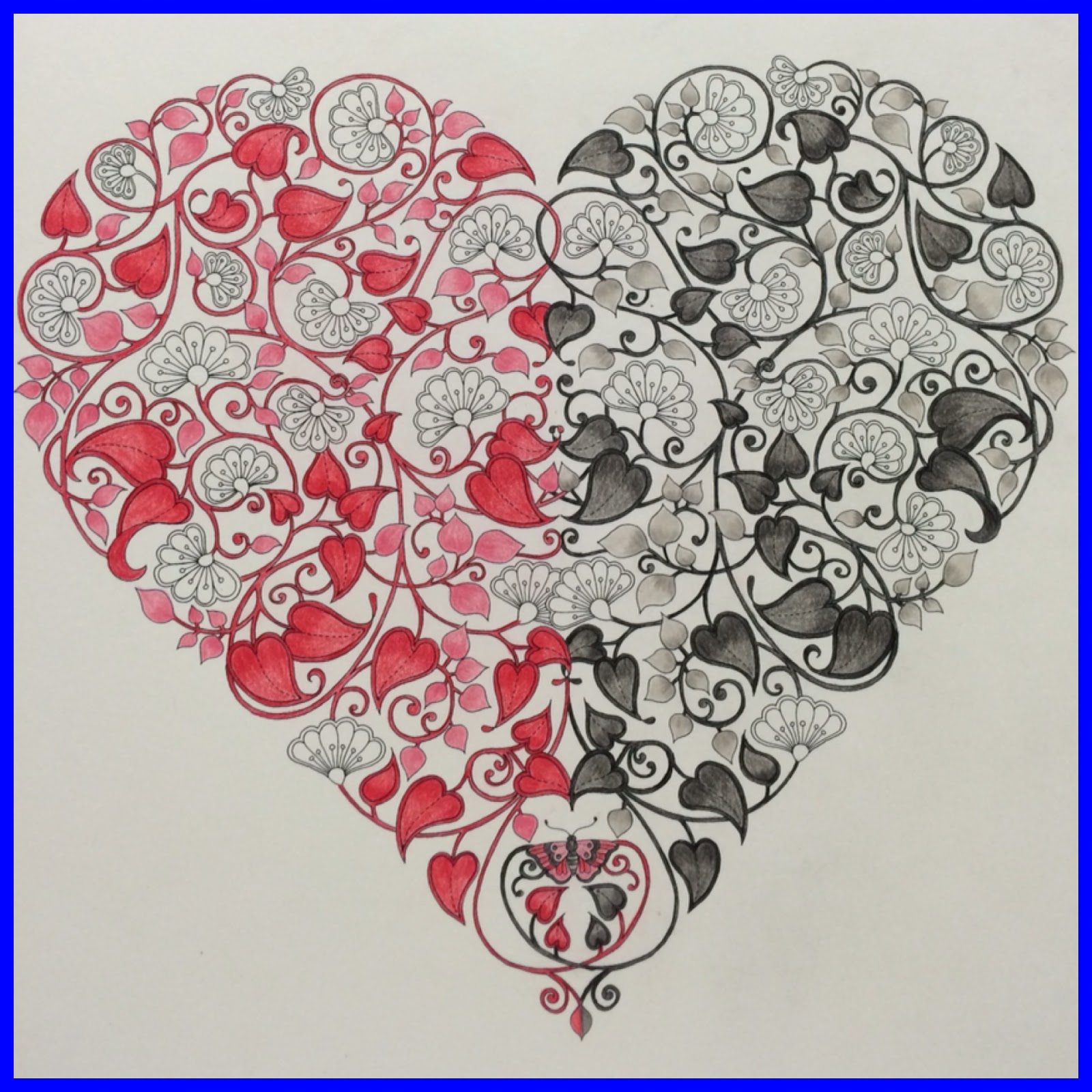
My piece called "Love Actually" is completed!

You'd be surprised when I tell you that I've only used a total of six colours to churn out this piece...two shades of red + one pink and two shades of grey + one black!

I was pleasantly amazed too that I could get a decent coloured picture with just 6 colours....so, you don't really need a box of many colour pencils to come up with your masterpiece.

Onwards to my next piece! ^_*

Related Posts Plugin for WordPress, Blogger...