After my first two coloured pieces, Enter My Secret Garden and Tree House, here comes my third piece which I shall call "Love Actually" (it's a title taken from a film)! ^_*
This piece by Johanna Basford is more abstract in nature compared to the previous two that were closer to real life art with stuff like tree house, leaves, flowers, cat, birds, etc....so my approach to colouring this was slightly different.

Blank Canvas

Work in Progress #1
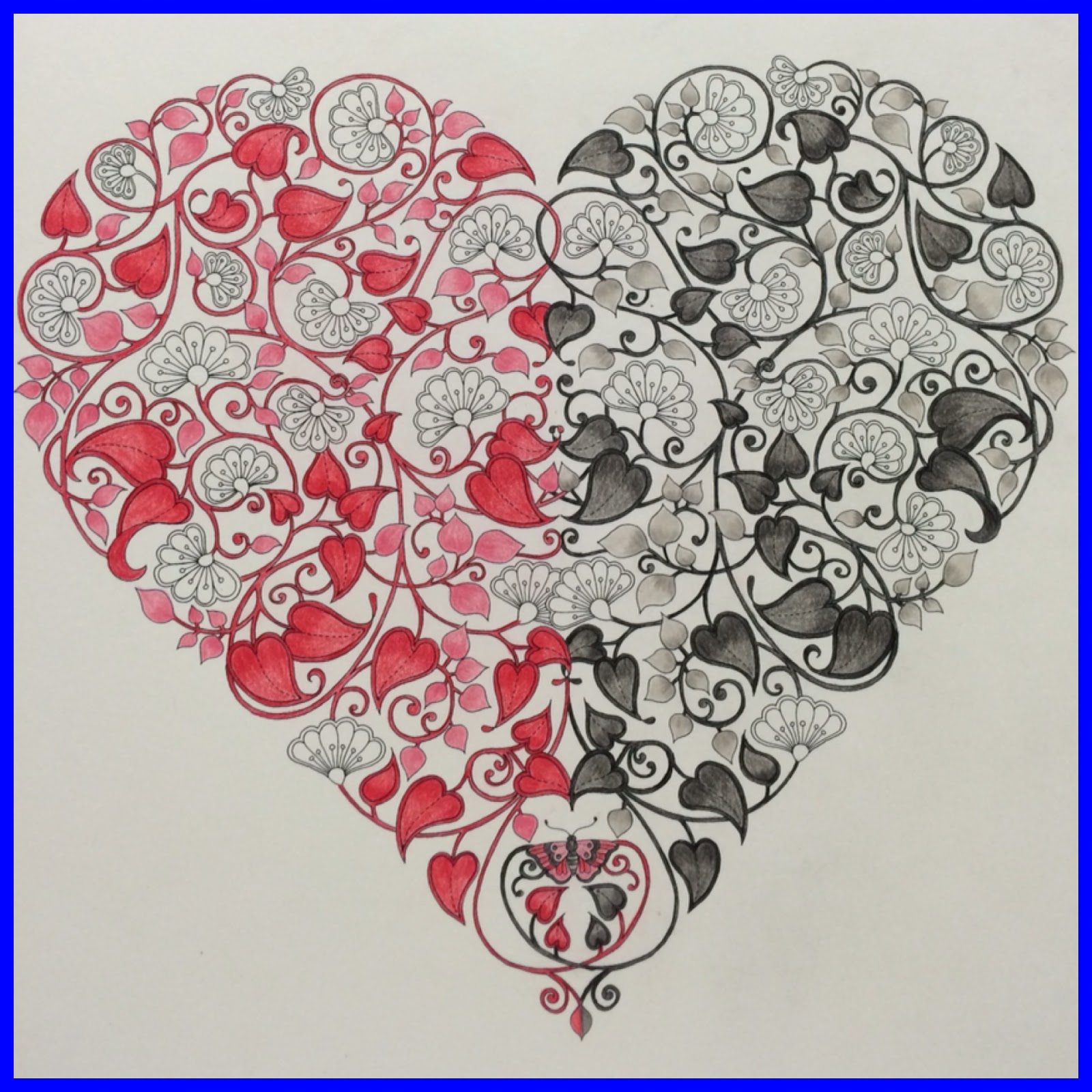
Tip #7 - I think there are two ways you can approach this...one, by using the actual colours of flowers, leaves and stalks or two, by using colours that are complete opposites of their common colours which one can do for a more abstract piece...like what I chose to do....red and black.
 Work in Progress #2
Tip #8 - When colouring very thin lines (like the stalks and outline of the flowers and leaves) which are quite difficult to do, I don't use a colouring motion but instead use a motion of drawing lines to try to fill the tiny gap with colour.
Tip #7 - I think there are two ways you can approach this...one, by using the actual colours of flowers, leaves and stalks or two, by using colours that are complete opposites of their common colours which one can do for a more abstract piece...like what I chose to do....red and black.

Tip #8 - When colouring very thin lines (like the stalks and outline of the flowers and leaves) which are quite difficult to do, I don't use a colouring motion but instead use a motion of drawing lines to try to fill the tiny gap with colour.

Work in Progress #3
Work in Progress #4
Tip #9 - I went with the symmetrical form of colouring as well this time (again for consistency and balance) but the only difference I made was I chose dissimilar colours for the corresponding similar parts.
Tip #9 - I went with the symmetrical form of colouring as well this time (again for consistency and balance) but the only difference I made was I chose dissimilar colours for the corresponding similar parts.

Work in Progress #5
I decided to change it up a bit in the colouring of the flowers in the centre but still keeping to the same colours without deviating too much.
I decided to change it up a bit in the colouring of the flowers in the centre but still keeping to the same colours without deviating too much.

My piece called "Love Actually" is completed!

You'd be surprised when I tell you that I've only used a total of six colours to churn out this piece...two shades of red + one pink and two shades of grey + one black!


Onwards to my next piece! ^_*

Gorgeous! This may be my favorite yet! You have colored it so beautifully and I think this piece deserves to be framed up and placed on the wall to take pride of place as part of your home decor!
ReplyDeleteThank you so much. You always have kind words to say. I see you prefer a more abstract piece then ;)
DeleteYour coloured masterpiece could radiate all your love out! It could show that you have a heart full of love, kindness and compassion.
ReplyDeleteSo many people believed that this colouring hobby helped to improve their well being and BP level. I must take over my wife's templates to colour too.
I like how you 'interpreted' my colouring with a heart full of love....kekeke! ;D I do it because I love to colour and if it brings about an improved well being, even better.
DeleteHmmm, will I be seeing any of your coloured masterpieces (after you've hijacked your wife's templates) on your blog anytime soon? ^_*
Oh No... My wife hid her colouring book, so I might need to buy my own copy. I am very interested in historical and arty stuffs. Have you seen some of my Art pieces done at college? http://twilightzone518.blogspot.my/2009/01/looking-back.html
DeleteWah, you're so talented....you put my colouring to shame! ;D
Deletequite an interesting approach that you took to this piece - and your thought process led to a successful result, really! :)
ReplyDeleteI'm quite pleased that my different approach to this piece brought about a nice end result! ^_^
DeleteBeautiful! I would never have thought to divide the colouring into halves - it's very effective.
ReplyDeleteI actually got the idea of two halves from something I saw online and just added my own spin to it (in the centre). Glad it turned out well =)
Deletethis is actually quite neat.
ReplyDeleteQuite only, ah.....kekeke! :'(
Delete